Should You Redesign Your Cleaning/Restoration Logo?
By Samantha Hager
Whether it’s the golden arches or the Nike Swish, a memorable logo can be all it takes to ensure your brand image is highly recognized and memorable. Facebook, Google, Coca-Cola, Pepsi, Apple, Instagram, Disneyland, NBC, and countless more companies can be identified solely based on their logo alone. This is no coincidence as every element of their logo has been carefully crafted with design, audience, color theory, and recognition in mind.
While the average carpet cleaning or restoration company owner is not likely to have focus groups and design experts on their side like these larger brands do, it doesn’t mean they can’t take a closer look at their personal logos and change things up for the greater good. With this in mind, let’s take a look at the power of a logo and how making minor adjustments can revamp your brand image and increase your engagement both in person and online in no time.
The power of a perfect logo
A great logo can truly help a brand to stand out, attract eyes, and be memorable all at once. To showcase this, here are some statistics regarding logos and branding that show their value specifically:
- Logos are the most recognizable brand identifiers at 75%, followed by visual style (60%), brand color (45%), and unique voice (25%)
- 42% of consumers say that a logo effectively conveys a company’s personality
- 50% of consumers are more likely to patronize a brand with a logo that they recognize
- 60% of consumers avoid brands that have odd, unattractive, or unappealing logos, regardless if they received good reviews
- The Coca-Cola logo is recognized by a staggering 94% of the world’s population
- One study in 2010 found that 69% of three-year-olds could recognize the McDonald’s logo
When looking at these data points, patterns begin to stand out. For instance, consumers want clear and definitive logos that they can attribute to the personality of the brand itself. Furthermore, consumers are more likely to choose brands with positive and simplistic logos as they appear more trustworthy and professional. Lastly, consumers at every age can recognize logos that are clear and concise (golden arches, Coca-Cola) making it a great way to appeal to any generation or audience imaginable. A few other elements that have been defined as qualities of a ‘perfect logo’ include the use of the color blue, three colors or fewer, a square or a horizontal rectangle shape, and a definitive logo style. The most popular logo styles are combination mark logos, illustrative logos, icon logos, and letter mark logos.
Below are each of these forms of logos respectively to show you what these design styles look like:
Combination mark logo:

Illustrative logo:
Icon logo:

Letter mark logo:
What you may immediately realize when seeing these varied logos is that they all have a very unique and memorable look about them. Now, the question you must ask yourself as a company owner is whether or not your logo has this same quality. If not, it may be time to analyze your current logo and find what needs to change just in time for the new year.
Analyzing your current logo
When analyzing your current logo, you won’t just want to take into account its visual simplicity and memorability but also a series of other elements related to your company as well. For starters, take a look at your brand image as a whole—are you laid back, are you highly professional, are you fun and modern? Once you have that defined, you can begin to build a logo that matches this energy to help potential clients understand your style before they even speak with you and your team.
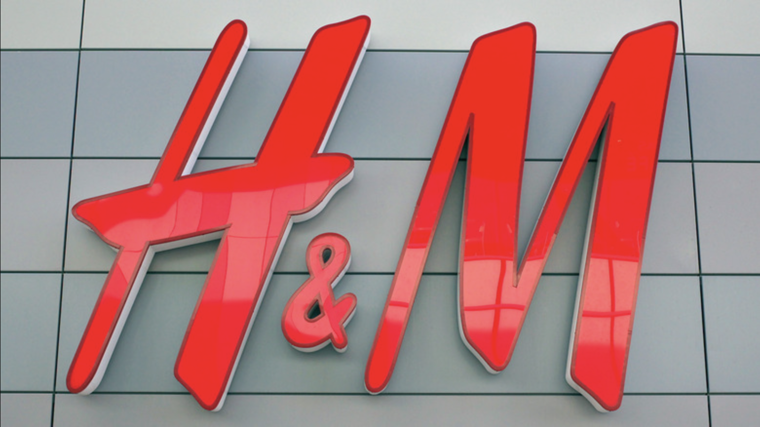
For instance, here’s an example of a very professional logo from a very professional company:

Meanwhile, here’s the logo for a much more high-energy and ‘edgy’ brand, Vice:
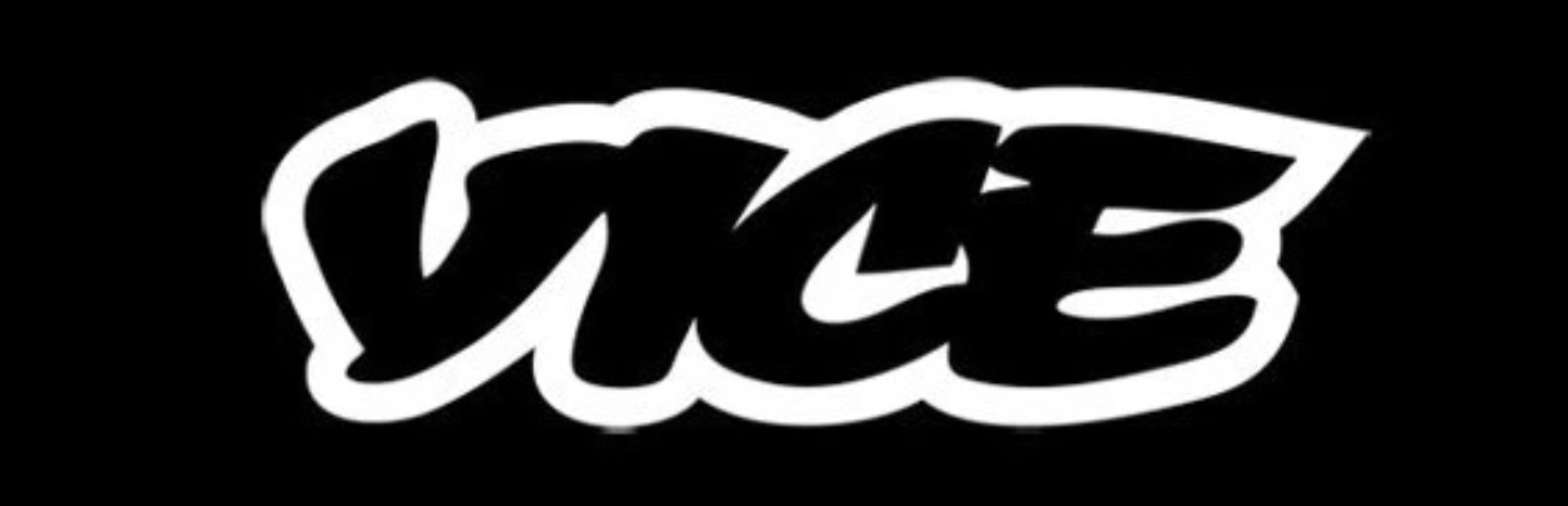
When looking at these two logos back to back, it’s clear how different they are from one another as well as how they allude to very different company images and personalities right off the bat.
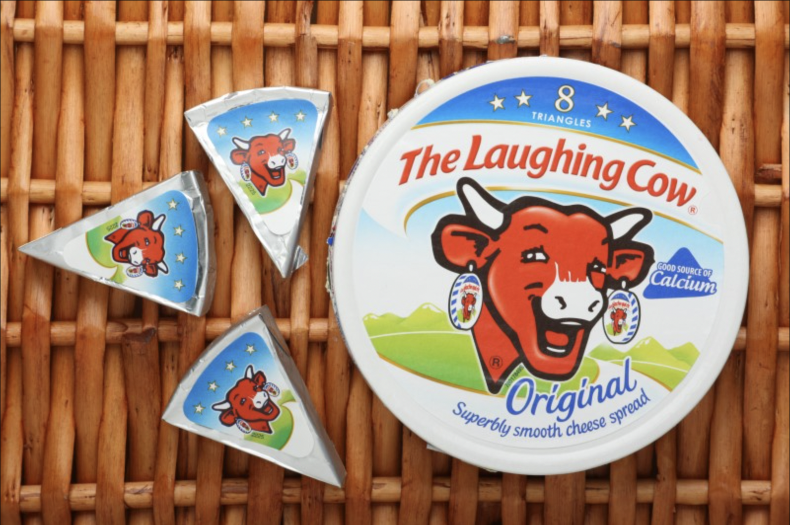
Next, you will want to analyze the size, shape, and colors of your current logo. Remember that less is more when it comes to logos. Knowing this, it’s clear why some of your competition may struggle with engagement online when their logos look less like Nike or McDonald’s and more like this:

While it may look nice and attract your eyes, the overly-complicated nature of it paired with the overuse of color makes it far less appealing than something more like this:

The other big bonus for the second design versus the first is its legibility at varying sizes as well as its ability to be printed and easily recognizable even from afar. To showcase this, take a look at both logos on shirts from far away below:

With the more concise and definitive logo, it is far easier to make out its design at any size making it a much better choice for print, branding, team clothing, and standing out from your competitors as well.
Lastly, when analyzing your current logo, take a moment to look at the competition’s logos as well. Brand emulation and competition are crucial to your success, and a logo is a perfect way to stand out at first glance in your local area. If their logo is complicated, your ability to have a more appealing logo could be the difference between getting the job or forfeiting it to them moving forward.
Once you’ve determined what you want to change about your logo, it’s best to also remember the basic principles of design and color theory. With these, you can redesign your logo just in time for 2023 and ensure that its memorability and positive response last for years to come.
Redesigning your logo with design principles in mind
According to Zippia, “The main characteristics of a good logo are that it’s simple, relevant to the brand it represents, and easily recognizable.”
Some other common characteristics of a good logo include being:
- Highly memorable
- Relevant over time
- Versatile
- Marketable
- Generally attractive
When you look at the most memorable and effective logos out there, you will be able to see these elements of design being used regularly. Another element from a design perspective to keep in mind is the use of color theory. A logo should typically have three colors or fewer, and blue, red, gold, black, and yellow are the most commonly used color in logos as they are highly appealing to consumers. Blue is the number one color choice since it is associated with trustworthiness and professionalism. You can see what each color is associated with by looking at this color theory guide.
Once you have some design ideas in mind, you can begin to develop them yourself using free design platforms such as Canva or Edit.org. Instead of relying on highly expensive logo designers, take your company’s image into your own hands and save money in the process.
With a new logo and a new image for your brand both on and offline, it’s time you harness the power of simplicity and memorability just as countless easily recognizable and beloved companies have done before you. After all, while you might not ever be as recognizable as Jack in the Box, your ability to think outside the box is sure to help you succeed!